Advise and design · UX and product design

Software that feels clear to use

Through UX-led thinking, interface design and practical solution design, we shape experiences that make tasks faster to complete, easier to understand and more consistent across teams.

The service

Designed around how people really work

UX and product design is how software becomes easy to understand and quick to use. It covers research into who uses a product and why, the structure of screens and flows, the visual interface, and the testing that shows whether it works. The output is not just attractive screens but a product people can pick up with little training, complete tasks in fewer steps, and trust with their work.

It suits organisations launching a new product, replacing an internal system that staff struggle with, or fixing a customer journey where people drop out. It also suits growing products where every new screen looks a little different from the last one. Poor usability carries real costs: training time, support calls, errors, abandoned forms and staff quietly working around the system with spreadsheets.

Good design starts with evidence, not opinion. That means watching real users attempt real tasks, testing early with simple prototypes, and treating accessibility as a requirement from the first sketch. We apply this to our own products, from the QuoteCloud editor to the TravelDocs app and the new WebDirector visual editor, and bring the same discipline to client projects so designs are practical to build and maintain.

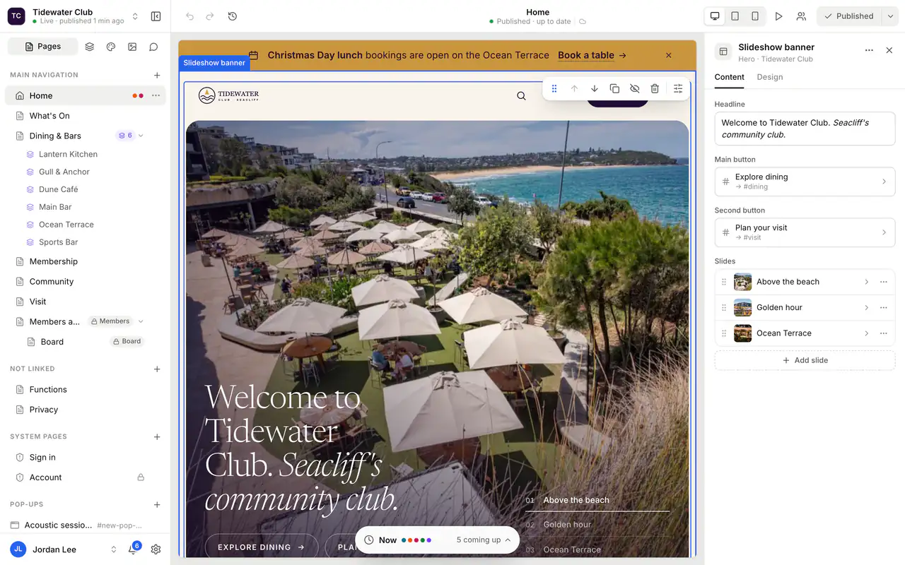
editor.webdirector.net
A carefully designed editing interface

Designed with users

Research and testing with the people who will use it every day.

Design systems

Reusable components so products stay consistent as they grow.

Accessible

Contrast, keyboard use and screen readers considered from the start.

Is it right for you?

This is for you if…

  • Staff need training or cheat sheets for a system that should be straightforward to use.
  • Customers abandon a form, signup or checkout before they finish.
  • Your product has grown screen by screen and no longer feels consistent.
  • You are planning a new product and want to test ideas before paying for development.
The problem

Sounds familiar?

If two or more of these ring true, this is where we can help.

  1. 01

    People need training for a system that should be obvious

  2. 02

    Customers give up halfway through a form or checkout

  3. 03

    Every screen in your product looks a little different

  4. 04

    Your site is hard to use on a phone

What’s included

What we deliver

Every engagement is scoped to your goals. These are the pieces we are asked for most.

01

User research

Interviews, observation and analytics review with the people who will use the product. It shows what they need, where they get stuck and which tasks matter most, so design effort goes where it counts.

02

Journeys and information architecture

Maps of key user journeys and a clear structure for navigation, content and screens. Agreeing this before visual design prevents expensive rework and keeps the product logical as it grows.

03

Wireframes and clickable prototypes

Simple layouts and interactive prototypes that let people try a flow before it is built. Changing a prototype takes hours, while changing finished software can take weeks.

04

Interface and visual design

High-fidelity screens with your brand, clear hierarchy and every state covered, including empty, loading and error screens. Developers receive a complete picture rather than having to guess.

05

Design system

A shared library of components, colours, type and patterns, documented for designers and developers. It keeps products consistent, speeds up new features and makes future changes far cheaper.

06

Usability and accessibility testing

Sessions where real users complete real tasks, plus reviews against WCAG accessibility guidelines. Findings are prioritised so the fixes with the biggest impact are made first.

User research and journey mappingWireframes and clickable prototypesInterface and visual designDesign systemsUsability testingAccessibility reviews
Decisions worth getting right

Design decisions that pay off later

How much research do we really need?

Less than many expect, but more than none. Talking to five or six users per key group usually reveals the most important problems, and a short round of testing on a prototype catches most usability issues before build. Larger studies are worth it for high-stakes products or diverse audiences. The real risk is skipping research entirely and designing from internal assumptions.

Should we invest in a design system now?

If you are building one small product with a short life, a simple style guide may be enough. If the product will grow, involve several developers, or sit alongside other products, a design system pays for itself through faster builds and fewer inconsistencies. You can start small with core components and grow it as the product does, rather than designing everything upfront.

Which accessibility standard should we aim for?

WCAG 2.2 at level AA is the widely accepted benchmark and is referenced by Australian government guidance. Meeting it helps people with disability and usually improves the experience for everyone, including people on phones or in bright sunlight. It is much cheaper to design for accessibility from the start than to retrofit it, so we build the requirements into components early.

How it runs

How a ux and product design project runs

Typical stages and how long each usually takes. Your plan is set during discovery, with working software to see at every stage.

How we work

  1. Understand

    1–3 weeksResearch with users and stakeholders, plus a review of analytics and any existing product. You get personas or user groups, key tasks and a list of the main problems to solve.

  2. Structure and prototype

    2–4 weeksWe map journeys, define the information architecture and create wireframes and clickable prototypes. You get a tested structure that your team and users have already tried.

  3. Design

    3–6 weeksHigh-fidelity interface design, all screen states and a design system of reusable components. You get production-ready designs, with full specifications that your developers can build from directly.

  4. Test and refine

    1–2 weeks per roundUsability sessions and accessibility reviews with real users, followed by targeted improvements. After launch, analytics and feedback guide further rounds so the product keeps getting easier to use.

Built on our products

Start from something proven

Where one of our products already solves part of the problem, we build on it rather than from scratch.

Questions

Common questions

Can you design for software another team will build?

Yes. We prepare designs, prototypes and component specifications in a form any development team can work from, and we are happy to stay available during the build to answer questions and review the result. Close contact between designers and developers matters, because small decisions made during build can easily change how a product feels.

How do you test designs with our users?

Usually in short one-on-one sessions, in person or by video, where people try to complete real tasks using a prototype while thinking aloud. We observe without leading them. A handful of sessions per round is typically enough to reveal the main issues, and we share short summaries and recordings, with consent, so your team sees the evidence first hand.

Can you improve an existing product without a full redesign?

Often that is the better choice. We start with a review of the product and its analytics to find the screens and flows causing the most difficulty, then improve them in stages. Incremental changes reduce disruption for existing users and let you measure the effect of each improvement before moving on to the next.

Do you design for phones and tablets as well as desktop?

Yes. We consider how each task is done on every device, which sometimes means a different layout or flow rather than a squeezed version of the desktop screen. Our own products include a native mobile app in TravelDocs and an adaptive QuoteCloud editor for phones and tablets, so we know where the hard trade-offs usually are.

How do we measure whether the design is better?

Agree a few measures before starting, such as task completion rates, time on key tasks, error rates, support requests or conversion through a form. Capture a baseline, then compare after launch. Qualitative feedback from users matters too. Good measures keep design discussions focused on outcomes rather than personal taste.

Need software built around the way your business actually runs?

Whether you’re planning a new SaaS product, custom business software, a mobile app or a better digital workflow, we’d love to hear what you’re working on.